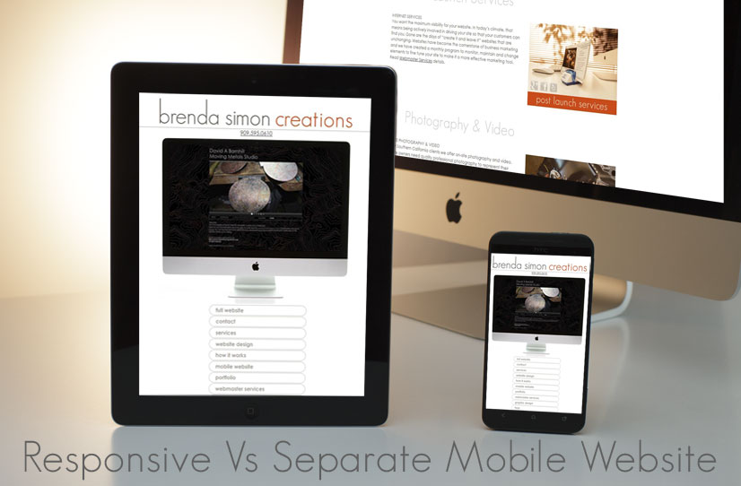
You know you need a mobile website. Next your web designer asks which strategy you want to adopt. More decisions can be frustrating, but let’s compare the options to simplify.
The choices are a
This type of strategy works well for news and informational website where the design and display of information doesn’t need to be controlled. Your graphic elements and all photos will still need to be reworked to accommodate the 3 platforms to minimize load times and excessive bandwidth use. Depending upon the size building a new responsive website can become a substantial investment. It does make updates a simpler—as there is only one website. Responsive is problematic for image heavy websites, which mean you are squeezing large photos into a tiny mobile screen, which is overkill. E-commerce can be challenging for responsive design.
Discuss with your website designer your budget and goal to decide the best mobile strategy for your business.
The choices are a
separate mobile site or responsive design.
There is a third choice called adaptive, but for most businesses the development costs are prohibitive.
which is better?
A separate mobile website resides on your web hosting next to your full website using a subdomain. This strategy allows you to build the site precisely for mobile devices. Tablets will display your desktop version. The key element is download time—you want the
mobile site to load quickly.
Keep graphics to a minimal, or allow interactive options for viewing images and streamline the design. You may not need all the information from your full website and the two are connected so visitors can move from the full site to the mobile and vice versa. a separate mobile site is built precisely for mobile ease
A separate mobile website
means updating 2 websites; although you’ll be more selective in what you add to the mobile website. Depending on the size, a separate mobile website can be far less costly than recreating your existing website using a responsive design. The cost of a total redesign for a large website is a substantial investment. For image heavy websites: photographers, websites with large images for their banners, slide shows, etc. a separate site can be the best solution.redoing your website is the time to consider
a responsive design
A a responsive design
responsive website
uses the same content for all devices. It displays differently on the desktop, phone and tablet. You may read how your designer will “only need to add some CSS code” for your existing site. That code is dependent upon how the original site was constructed. Most likely you will need to build a new website, which in itself is “responsive”.This type of strategy works well for news and informational website where the design and display of information doesn’t need to be controlled. Your graphic elements and all photos will still need to be reworked to accommodate the 3 platforms to minimize load times and excessive bandwidth use. Depending upon the size building a new responsive website can become a substantial investment. It does make updates a simpler—as there is only one website. Responsive is problematic for image heavy websites, which mean you are squeezing large photos into a tiny mobile screen, which is overkill. E-commerce can be challenging for responsive design.
Discuss with your website designer your budget and goal to decide the best mobile strategy for your business.