Users have little patience for stretching
a desktop website on their mobile phones.
a desktop website on their mobile phones.
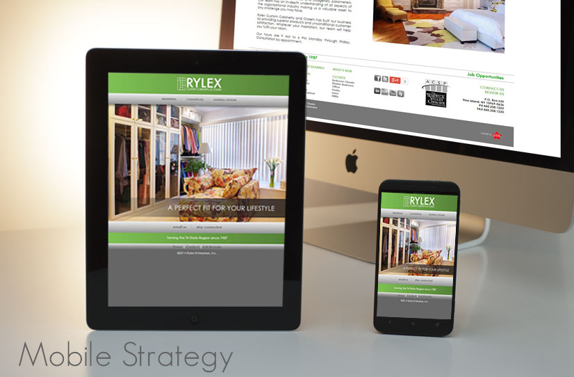
Mobile ready
is a must. While your desktop website will display on multiple mobile devices, targeting themobile market
is a different mindset. Simplicity is key. A mobile website needs to be a fast loading. Key factors are click to call, click for directions, contact, services and social media.Many users have limited bandwidth plans. This alone is crucial to a potential customer accessing your website. They are looking for
fast loading sites
to avoid using their bandwidth. From a business point of view—think of it as a courtesy.People have preferences and you want to accommodate their surfing habits. If the preference is your full website—make that easily available, don't force their tablet or smartphone onto a mobile website and vice versa. Make sure they can switch back and forth—having a mobile access button on your full website. Making your website mobile is one more part of your marketing plan.
Beyond courtesy and logic Google, with Twitter, created a project, Accelerated Mobile Page (or AMP, for short), designed to make really fast mobile pages. This will affect how your website is returned in search results.
Google shook things up
Beyond courtesy and logic Google, with Twitter, created a project, Accelerated Mobile Page (or AMP, for short), designed to make really fast mobile pages. This will affect how your website is returned in search results. In 2015 Google implemented its preference to a mobile ready website over a desktop reasoning this is what the user desires. Which means: When a user searches for a business on Google on their phone—Google will return mobile ready websites before desktop version. Your business is now at a disadvantage by only having a full desktop website.choose a platform to deliver your mobile content
There are multiple platforms for
serving your content to mobile devices.
Compare responsive website versus separate mobile website. Each has pros and cons and different costs. Brenda will discuss your options.While there are many solutions selling “free” mobile websites—businesses need to control and maintain their Internet presence. “Free” still means something is out of your control. Know the trade-off, before using free products and confusing your target visitors with websites you may abandon in time. Read a comparison of custom vs template sites.
"...I was looking for someone to design a website for us and a friend in the auto repair business suggested I try Brenda Simon Creations. Brenda is very helpful, knowledgeable and walked me through the whole process. She came to our business, talked to us about what we do and designed a site that looks great and works great. (She also helped us with a new logo)...I HIGHLY recommend Brenda. Having her do a website for us was a terrific return on investment. She has since done some upgrades to our site, and is just now designing a mobile site for us as well.” —Fast Auto Salvage, Duarte, CA via Yelp
A mobile ready website is a must for businesses strengthening their Internet marketing. We serve